My Role: Principal Designer
Core Team: Principal Designer, Creative Director, Senior Visual Designer, Product Manager
Links to Design Docs
Overview
Before smartwatch and wearable app conventions had been really established, I designed a complete running app experience for a fitness watch, including run setup, GPS acquisition, in-run interaction, post-run summary, and historical run management.
The work addressed a design problem with no established playbook. How do you deliver a rich, data-dense fitness experience on a device with a tiny screen, limited input options, and a user who’s physically in motion?
The Design Challenge
A running watch isn’t a phone strapped to your wrist. The fundamental constraints are different in ways that affect every design decision. The screen is small, targets are difficult to acquire, the user is moving, glanceability matters, and physical hard keys become a primary input method because sweaty fingers and bouncing wrists make touch finicky.
At the same time, runners are hungry for more data, not less. When we interviewed people about their running habits, the top three stats they wanted visible during a run were pace, heart rate, and distance, but splits, elevation, gait, stride rate, and elapsed time were close behind. Most wanted to customize what was displayed. The challenge was delivering all of that without building an interface that demands focused attention.
Every interaction had to be evaluated against whether or not a runner could do it without breaking stride.
Concept Testing
The design process included a structured concept test I planned and moderated. Participants performed tasks using two different paper prototypes, followed by treadmill sessions with two different fitness watches. The study used think-aloud protocol with observers taking notes and photos, followed by quantitative experience surveys.
The prototypes tested fundamentally different interaction frameworks. One used a hard key to start a run with settings presented before the run began, vertical swipes to access the map, and tap-to-dismiss notifications. The other used a hard key to start the run immediately with settings accessible during the run, horizontal swipes to navigate between stats, notifications, and map views, and a vertical swipe to access a system menu.
This wasn’t validation testing, as we were too early in the design process for that. It was an investigation into which interaction patterns felt right on a wrist while a body was in motion.
Interaction Model: Hard Keys vs. Touch
The fundamental design decision was how start, pause, and end a run should be triggered. I explored four approaches:
Hard key start/end with touch pause separated the highest-stakes actions (starting and ending a run) onto physical buttons that could be activated by feel, while keeping the lower-stakes pause action on screen where accidental activation was less consequential.
Single press stop, double press pause attempted to consolidate controls but introduced a timing ambiguity that made the system feel unreliable in testing.
Touch-only controls with collapsed and expanded states kept everything on screen but required too much visual attention during a run.
Pause menu interstitial introduced a confirmation layer that added safety but also added friction to the end of a run when a user wants to stop and immediately see their results.
The final approach used hard keys for start and pause with a touch interaction for end, paired with an elapsed time banner that served as both a status indicator and an interaction anchor. This gave runners tactile certainty for the actions they’d perform most often while in motion, and reserved touch for the moment of finishing a run,when they were no longer in motion.
The concept testing validated this direction. Participants found using a hard key for start/pause intuitive and expected. There was no consensus about what a second hard key should do, which confirmed our instinct to keep the hard key mapping simple rather than overloading physical buttons with multiple functions.
The In-Run Experience
Testing confirmed that tapping and swiping were easy gestures on a watch as long as the targets were large enough. Participants noted that swiping felt natural on the wrist, but their tolerance for the number of swipes required to acquire a target was low. They also flagged the need for visual affordances signaling that a swipe gesture was available. These findings shaped how the in-run screen system was organized.
There were four in-run views:
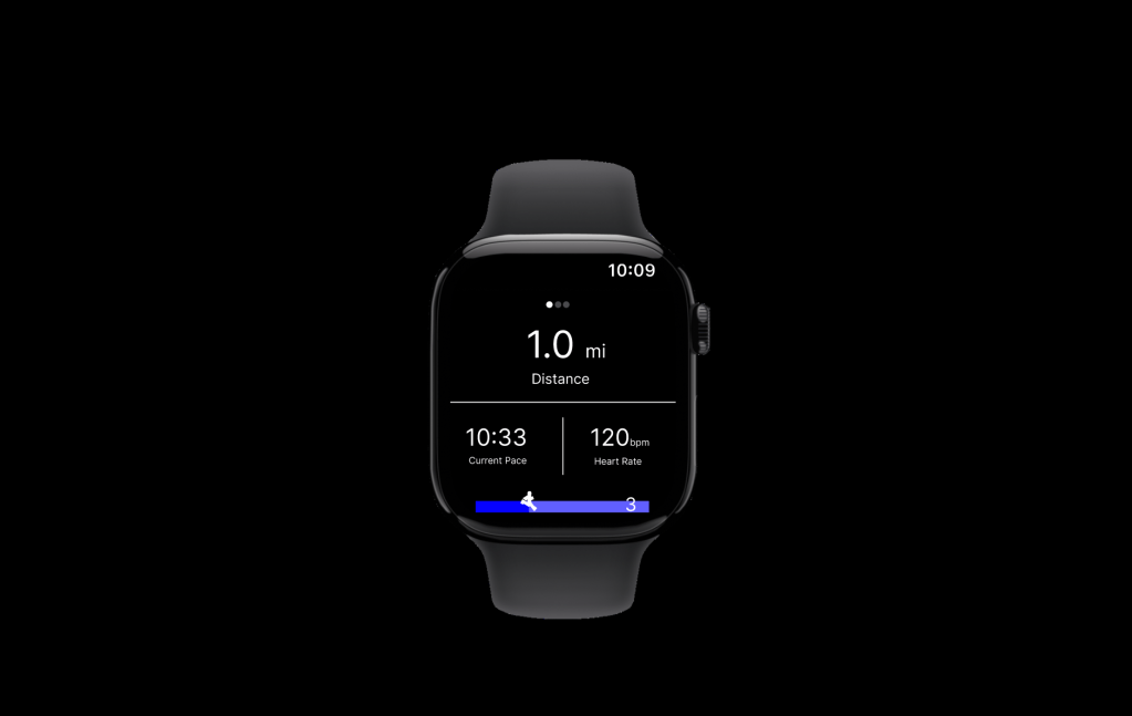
Stats Screen
A customizable layout defaulting to a 1×2 grid showing the runner’s chosen metrics. Stats were tappable to cycle through available data points (pace, distance, time, elevation, calories, speed). Runners could configure the display without navigating away from the run. A double-tap detail view was scoped as an enhancement for runners who wanted deeper data mid-run.
Half Map
A north-oriented map showing the runner’s current location and route, designed for quick orientation checks. The split between stats and map let runners maintain awareness of both their performance and their position without switching views. (Participants did not love this view. Most preferred a full-screen map and questioned whether they’d use a map mid-run at all, since many had a route in mind and would only consult a map if lost. The half map was retained as a quick-glance option but the full map became the primary view.)
Full Map
A street-level map with pan and zoom activated by double-tap, plus toggle controls for contextual markers like water fountains and restrooms. Four zoom levels balanced route overview against street-level detail. Participants confirmed that swiping to access the map felt natural, and wanted pinch-to-zoom for direct manipulation. This was consistent with what they expected from phone map interactions, even on a smaller screen.
Laps Screen
A running table of lap splits for interval training, supporting both auto-laps (triggered by distance) and manual laps (triggered by hard key press), configured before the run begins.
GPS Acquisition
GPS lock is the unglamorous interaction that gates the entire experience. The design used a 60-second countdown that communicated progress without demanding the user’s attention. It had a retry option if acquisition failed and a fallback to run without GPS. This last option was a critical design decision. Rather than blocking the runner entirely, the system acknowledged that sometimes you just want to run, and an imperfect data set is better than no run at all.
Notifications
Notifications slid in from the left edge and stacked when multiple arrived simultaneously. The system displayed contextual alerts (nearby water fountains, restrooms), device alerts (low battery), and status updates (GPS signal quality).
Research shaped the notification strategy in two important ways. First, participants confirmed that auto-dismissing toast notifications were the preferred pattern but they also wanted the option to tap or swipe to clear it early. Second, while about half of participants were interested in route-based landmark notifications (restrooms, water fountains), most were not interested in seeing social notifications during a run. This validated the decision to prioritize contextual, run-relevant alerts over the social features.
Run Lifecycle
The run lifecycle was designed around a principle of zero data loss. Runs were saved automatically on completion with no option to discard. This was a deliberate choice. The cost of accidentally losing run data far outweighed the minor inconvenience of an unwanted run appearing in history (The history could be cleaned up later).
Run Setup offered configuration for run type (outdoor, treadmill, laps), lap settings, route selection, goal type (time or distance), and stats layout.
Run Summary appeared immediately after ending a run, displaying key stats and a route map with options to share to socials. Research revealed that runners wanted explicit control over which run details to include. One participant specifically mentioned not wanting to share a “bad run.” This informed a sharing model that was opt-in and selective.
Past Runs presented a chronological list with sync status indicators distinguishing between locally-stored and cloud-synced data. Each run’s detail view mirrored the summary screen.
Why This Matters
This project required designing a complete fitness application for a form factor that had no established interaction conventions. Wearable design patterns that are now taken for granted like how to handle GPS acquisition, how to balance glanceability with data density, when to use hard keys versus touch, had to be reasoned through from first principles.
The work also demonstrates that design and research aren’t separate phases, they’re interwoven. Conducting testing scenarios while someone is in motion on a treadmill is not exactly routine user testing, but it, along with paper prototype validation, generated findings that directly changed the design. The half-map concept was deprioritized, notification strategy shifted away from social, touch target sizing became a first-order constraint, and the hard key mapping was simplified based on participant expectations.
The scope demonstrates my ability to operate across abstraction levels simultaneously. Defining an interaction model for hard key versus touch input is systems-level thinking. Designing the notification persistence timing and GPS fallback behavior is detail work. Putting runners on treadmills to see which interactions survive contact with sweaty wrists and divided attention is testing work under real conditions.
